overview
Zelle is a new payment network created to send money within minutes between any network bank in America using only your recipient's mobile number or email address. Zelle is also built with the functionality to send and receive payments with a debit card or connect directly to your bank account via OAuth to send and receive with your checking or savings accounts. Outside of a standalone app, Zelle at the network level exists within every partner bank's mobile application and website, where each partner bank utilizes the Zelle network to send and receive money instantly across different banks.
The network is built on the backs of the founding banks (such as Chase, Wells Fargo, Bank of America, Capital One, and Citi bank), and the entire Zelle network consists of over 30 financial institutions across America.
As the first designer hired at Zelle, I was tasked to assist in architecting, designing, and launching America's largest payment network, as well as designing the standalone Zelle app, creating many of the standards that each network bank builds to, and helping building out the product and design teams. Within it's first quarter of launching, the Zelle network has averaged 65,000 new registered users a day since launch and committed over 60 million transactions.
Some required features of the app included the ability to send payments instantly, request money, split payments, add memos to transactions, and view nearby and recent contacts.
Responsibilities
- Architect and create flows
- Create UML charts
- Create wireframes
- Adjust existing concepts and designs
- Create animations
- Create high fidelity prototypes
- Create user testing scenarios and scripts
- Synthesize data from test results
- Write product requirements and user stories
- Write acceptance criteria
- Write product specifications
- Worked with 3 other external companies and 19 banks to develop the network
- Work with multiple internal teams including business development, legal, development, marketing, operations, customer service, and risk and security
- Assist in the creation of Zelle design requirements and standards used by banks
- Build out the design and product teams
UML Diagrams and User Flows
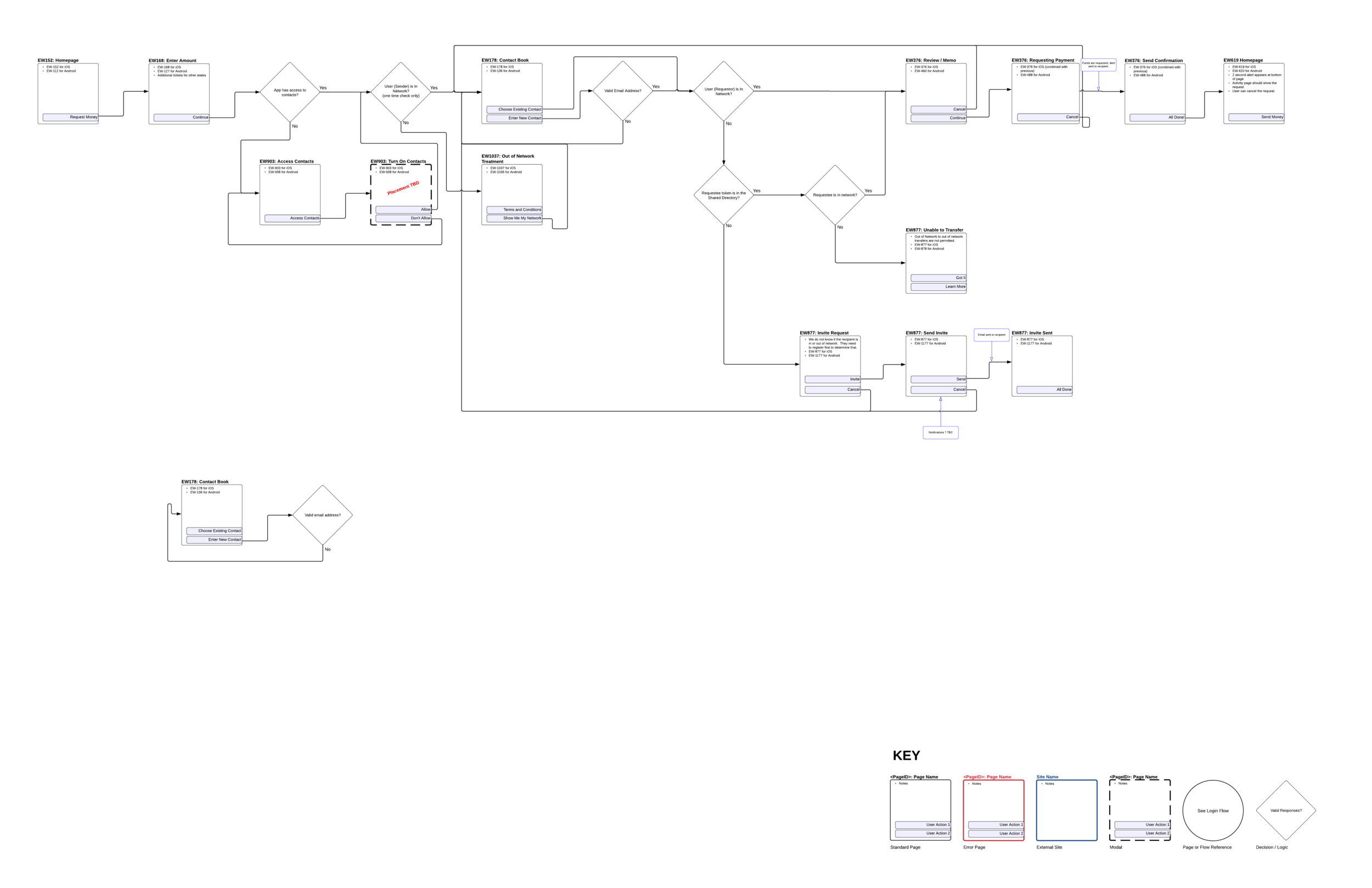
While creating the app, documentation was constantly being created to make sure development had what they needed to build the app correctly. One such deliverable was UML diagrams filled with decision trees and API calls so that whoever was reading the documentation could understand both the logic that was being built into each page and what type of backend calls they would need to be prepared to implement when the time came. Every piece of the app (send, request, split, enroll, settings, activity, and security) was charted out and continuously updated throughout build cycles.
Here's a partial UML diagram and a few user flows made for the Request section of the app.
wireframe Iterations
These are some of the wireframes made for the Select Account section during the Request Money flow. The multiple iterations were trying to solve the problem of changing the bank account where a requestor would receive the funds at, while also dealing with the email or mobile number that the funds would be delivered though (product requirement from banking backend limitations). An additional challenge was deciding on what would happen if an account had no email/mobile tied to it, and if the user would be able to see their ineligible receiving accounts.
Some changes were made to activity to account for functionality that had been missed before due to unknown use cases and usability issues. For instance, because details such as the fund receiver's email or mobile address was crucial to identifying any transactional errors for customer service, it became necessary to then add this piece of information to the activity detail. Furthermore, there was originally no Activity Detail Screen design made for the use case of someone requesting money from you, as they were only view via "cards" (think Tinder), this entire screen needed to be made. Unlike any other Activity Detail Screen, this one would require the functionalities to be able to respond to a request as well as write a memo back to the requestor.
Animation Sample
This is a quick animation sample used in the Zelle app. This is a three-piece animation where the middle "swirling" is capable of looping infinitely to account varying loading times.
Start animation
Middle animation
End animation
Testing prototype
A prototype was also built within Justinmind to assist with the testing of the product. The test was not so much a usability or user flow test as it was to gather more high level data about a user's understanding of the product.
Further Documentation
Because the company was so massive and pushing to launch a v1 product so quickly, Confluence was heavily utilized. Every flow and use case in the app, as well as details specs for each screen were documented within Confluence. Here is a quick sample of a very large Confluence page.


