Overview
The Kohl's project was a 2-week sprint with Kohl's with the goal of increasing both the retention and acquisition of members for the Kohl's Wallet and Kohl's credit card. The end product was to be a presentation on how the goal could be achieved.
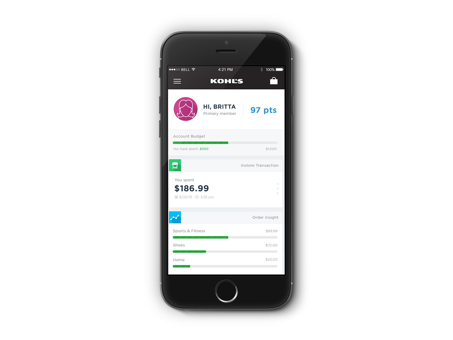
Some of the changes that were proposed included beacon-based alerts, single-sign-on (by use of current signin credentials), other streamlined processes during sign on, an a credit card control hub designed around entire families. This app also took on a feed-like approach in attempts to drive more user engagement. Furthermore, according to Kohl's data, the middle-aged housewife was by far their top consumer. As such, the app was designer with her as the focus.
Because of the extremely rapid process of this project, designs went straight from sketches to visual design.
Responsiblities
- Ideation
- Wireframes
- Story-telling strategy
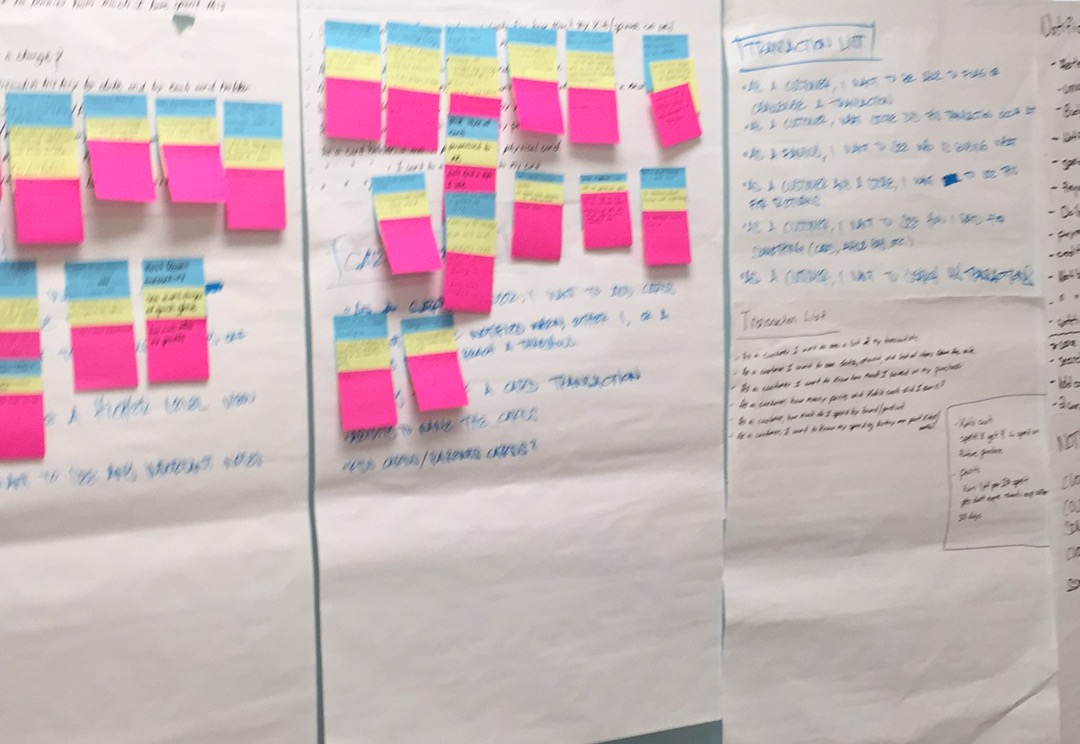
Prioritizing Feature Sets
Following a quick ideation phase, features were prioritized in phases.


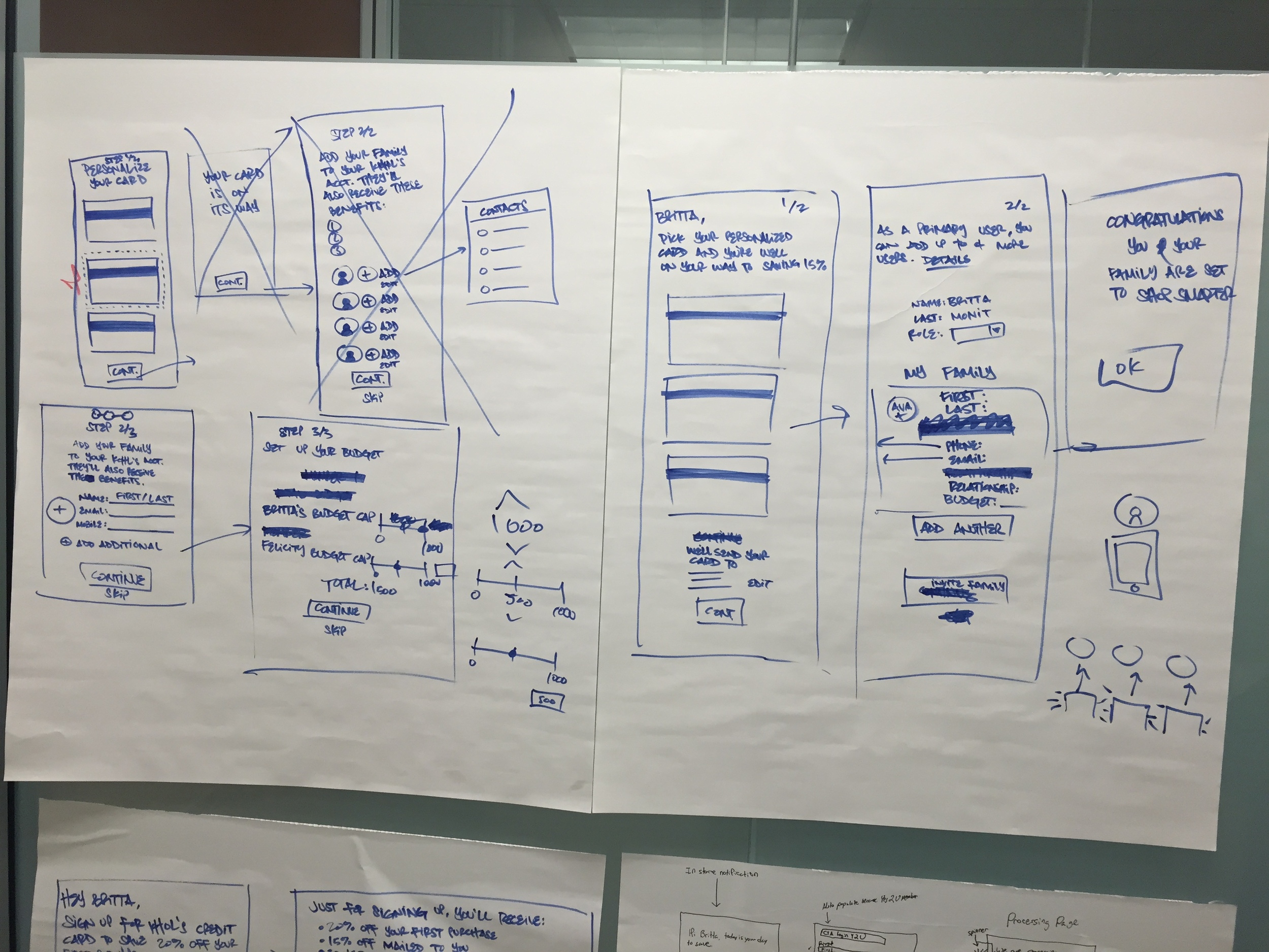
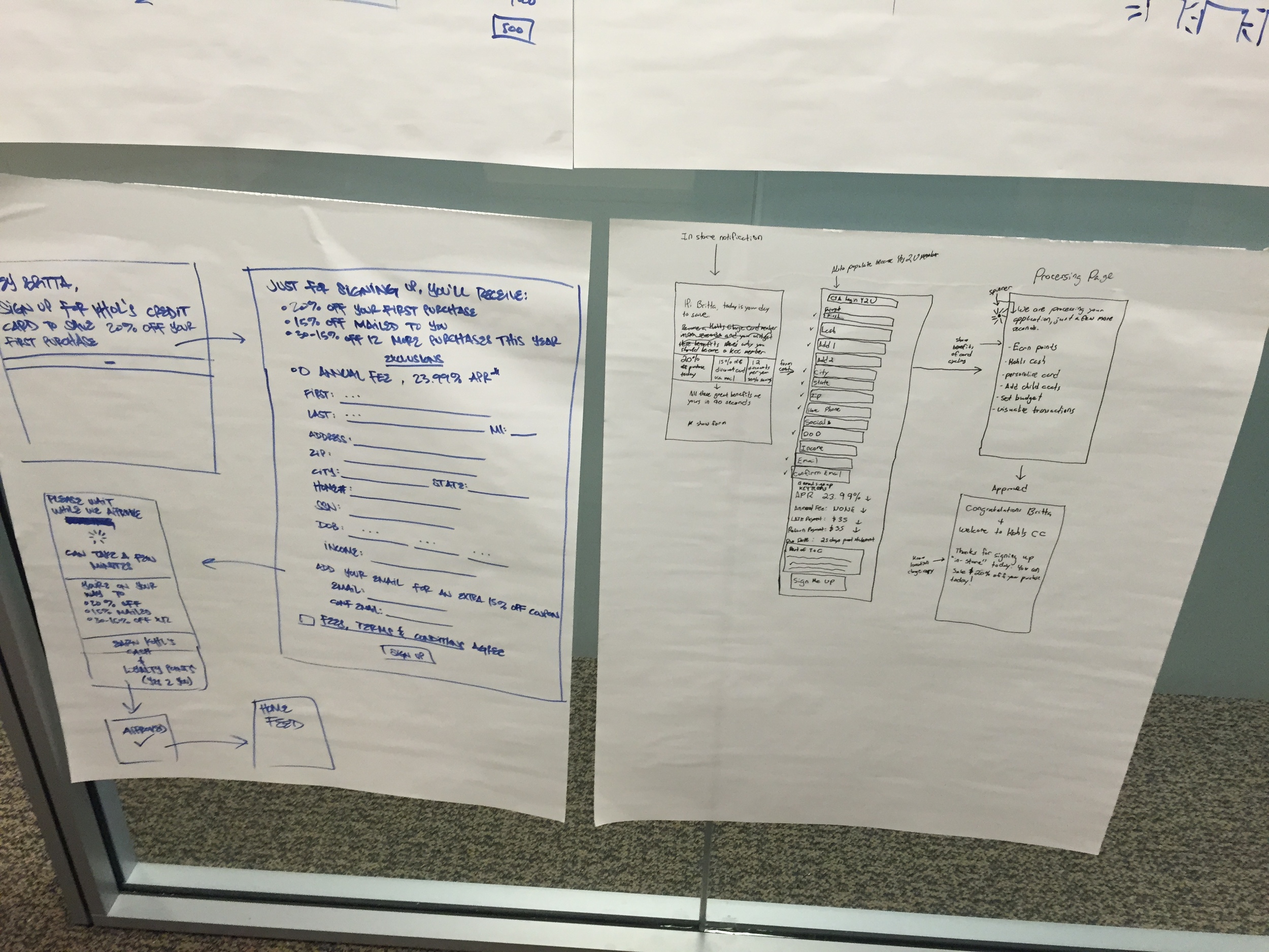
Sketching
Due to the time crunch, sketches were developed immediately after the features and went straight to visual design afterwards.


